Statistics, Charts and R
R is an open source environment for statistical computing. It can do some pretty neat breakdowns of your data and has a lot of built in functions for doing so. One of it's great strengths is generating production quality graphics and charts. This is what I needed it for and what I'll be explaining here in a moment. I learned R by watching a video introduction to R created by Decision Science News. There were 2 actually. But not very long and it got me to a base level. I then installed R on my Mac, it was cake. Go to the R site, download the DMG, run the R executable and you're ready to go. That got me up and running so I could start playing around on my own and using other examples from the web. YMMV on other platforms.
Now for the example. Let's set the stage. Say you have some data in a table, for example, a race my girlfriend competed in, the 2006 San Diego 10K race. I copied, pasted that data into a file, scrubbed it down, did some math with perl to get me the # of seconds, and ended up with a CSV file. Download the file, save it locally, read that file in with R:
race<-read.csv("race.csv")
You are reading that CSV file in as a table into a variable called 'race'. Because that CSV has a header as the first line, it automatically assigns variables based on those column names. To reference those columns, use race$CITY, to check out the 'CITY' column. So to check out what you've just done, type "race</span>" on the console. Typing the variable name will spit it all back out. To see a breakdown of what that variable contains, type:
summary(race)
To see stats on the racers ages, type in:
summary(race$AGE)
Which spits out:
Min. 1st Qu. Median Mean 3rd Qu. Max.
10.00 28.00 35.00 37.06 44.00 81.00
Minimum age of a runner was 10, oldest was 81. Average age was 37.06 years old. Doing this for race$SEX shows us there were 411 women and 474 men. Neat! Now for the visuals:
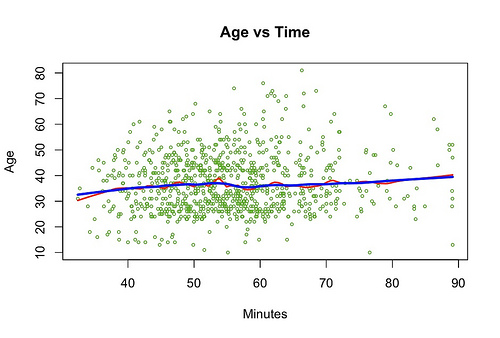
Below is a script I used to generate the graph above. You can see how I am plotting the dots, and drawing both lines:
race<-read.csv("race.csv")
Main Plot.
plot(race$SECONDS/60,race$AGE,
col="#5fae27",
main="",
xlab="Minutes",
ylab="Age",
cex=0.5,
type="p")
Set the Title
title(main="Age vs Time")
Draw the Red Line
lines(stats::lowess(race$SECONDS/60,race$AGE,f=0.1),
col="red",
lwd=2)
Draw the Blue Line
lines(stats::lowess(race$SECONDS/60,race$AGE,f=0.3),
col="blue",
lwd=3)
Not too hard, not too much code...pretty easy in fact! One of the great things about R is the built in help. Any of those functions, just type: ?function ..and you'll have immediate help. I encourage you to do that for the example above, to better understand it. It will describe far better than I can how each one of those functions works.
Let's generate another one, a histogram. That's easy:
hist(race$AGE,col="RED",xlab="Age",breaks=100,main="Histogram of
Racers Age"
To generate this:
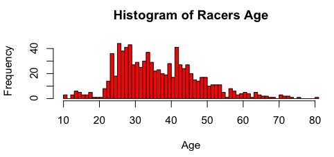
So, what did I learn from the creation of this plot? My initial suspicion was that younger people would do better in the race...the data shows that is's almost average across the board. The average age is in the late 30's, but the histogram shows the biggest group was mid-late 20's. Hardly anyone in their early 20's even entered the race...too busy drinking? Also, there is a neat little cluster at the bottom left of the plot that shows a group of young kids in their teens that did well.
I have been making more of these, mostly around sysadmin type stuff. I'll post those as I get more time.